
この記事では、ReactのプロジェクトにMUIのDataGridをインストールして、基本的な設定から使い方までを段階的に説明します。初心者でも分かるように、インストールからデータの表示、列のカスタマイズ方法までを説明したいと思います!
 もちた
もちた僕も仕事でも個人開発でもMUIは使っているのですが、かなり使い勝手が良くおすすめです!
ステップ1: 環境設定
MUIのDataGridとMUIに必要なライブラリをインストールします。
npm install @mui/x-data-grid @mui/material @emotion/react @emotion/styled @mui/styled-engine-sc styled-componentsステップ2: DataGridの使用
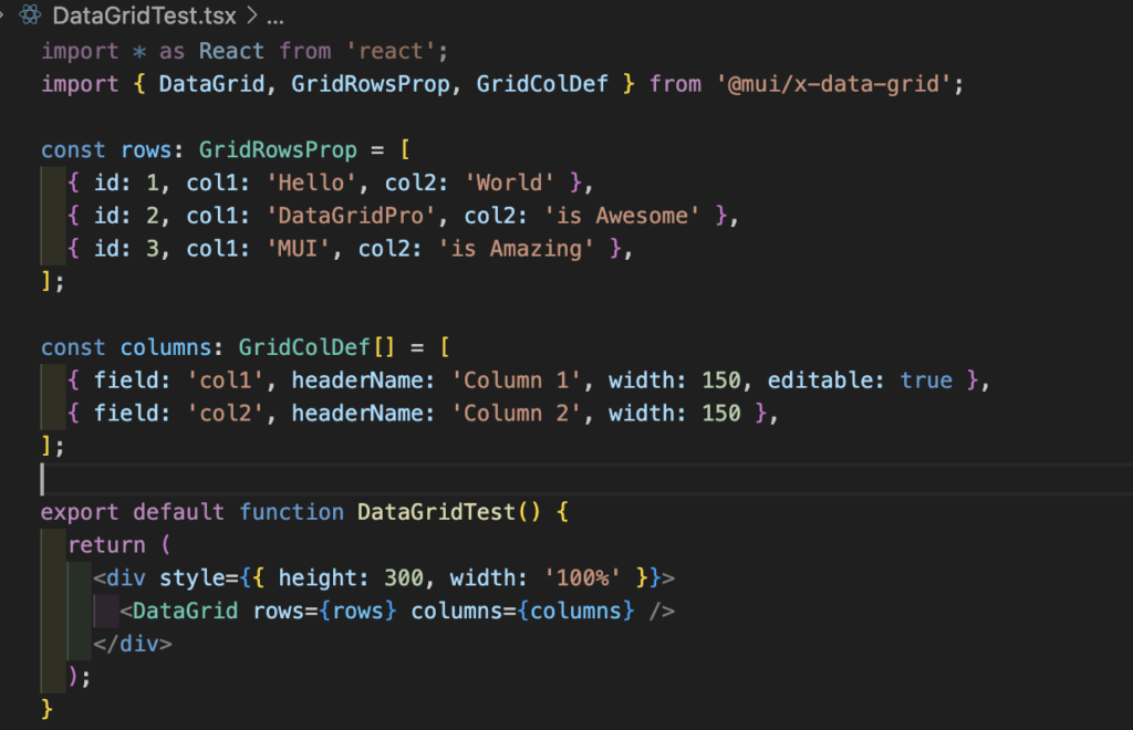
以下のコンポーネントを作成し、App.tsxで呼び出してください。
import * as React from 'react';
import { DataGrid, GridRowsProp, GridColDef } from '@mui/x-data-grid';

const rows: GridRowsProp = [
  { id: 1, col1: 'Hello', col2: 'World' },
  { id: 2, col1: 'DataGridPro', col2: 'is Awesome' },
  { id: 3, col1: 'MUI', col2: 'is Amazing' },
];

const columns: GridColDef[] = [
  { field: 'col1', headerName: 'Column 1', width: 150 },
  { field: 'col2', headerName: 'Column 2', width: 150 },
];

export default function DataGridTest() {
  return (
    <div style={{ height: 300, width: '100%' }}>
      <DataGrid rows={rows} columns={columns} />
    </div>
  );
}
import DataGridTest from "./DataGridTest";
export function App() {
return (
<div className="App">
<DataGridTest />
</div>
);
}
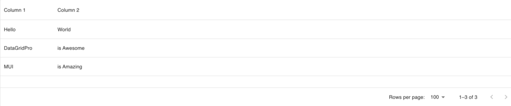
export default App;以下のようなテーブルが表示されます!
ステップ3: DataGridのカスタマイズ
MUI DataGridは、簡単なオプションを設定するだけで高度にカスタマイズ可能です。
今回はCommunity(無料版)の機能をいくつか紹介します!
編集機能(Editing)
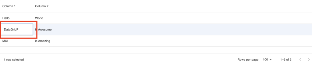
カラムの定義にeditable: true を追加することで、セルをクリックすることで、セルの編集が可能になります。
const columns: GridColDef[] = [
  { field: 'col1', headerName: 'Column 1', width: 150, editable: true },
  { field: 'col2', headerName: 'Column 2', width: 150 },
];
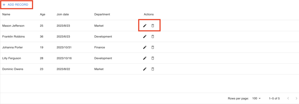
カラムのgetActions オプションやその他のオプションを使用することで以下のように行の追加や削除、編集が可能になります。
import * as React from 'react';
import Box from '@mui/material/Box';
import Button from '@mui/material/Button';
import AddIcon from '@mui/icons-material/Add';
import EditIcon from '@mui/icons-material/Edit';
import DeleteIcon from '@mui/icons-material/DeleteOutlined';
import SaveIcon from '@mui/icons-material/Save';
import CancelIcon from '@mui/icons-material/Close';
import {
  GridRowsProp,
  GridRowModesModel,
  GridRowModes,
  DataGrid,
  GridColDef,
  GridToolbarContainer,
  GridActionsCellItem,
  GridEventListener,
  GridRowId,
  GridRowModel,
  GridRowEditStopReasons,
  GridSlots,
} from '@mui/x-data-grid';
import {
  randomCreatedDate,
  randomTraderName,
  randomId,
  randomArrayItem,
} from '@mui/x-data-grid-generator';

const roles = ['Market', 'Finance', 'Development'];
const randomRole = () => {
  return randomArrayItem(roles);
};

const initialRows: GridRowsProp = [
  {
    id: randomId(),
    name: randomTraderName(),
    age: 25,
    joinDate: randomCreatedDate(),
    role: randomRole(),
  },
  {
    id: randomId(),
    name: randomTraderName(),
    age: 36,
    joinDate: randomCreatedDate(),
    role: randomRole(),
  },
  {
    id: randomId(),
    name: randomTraderName(),
    age: 19,
    joinDate: randomCreatedDate(),
    role: randomRole(),
  },
  {
    id: randomId(),
    name: randomTraderName(),
    age: 28,
    joinDate: randomCreatedDate(),
    role: randomRole(),
  },
  {
    id: randomId(),
    name: randomTraderName(),
    age: 23,
    joinDate: randomCreatedDate(),
    role: randomRole(),
  },
];

interface EditToolbarProps {
  setRows: (newRows: (oldRows: GridRowsProp) => GridRowsProp) => void;
  setRowModesModel: (
    newModel: (oldModel: GridRowModesModel) => GridRowModesModel,
  ) => void;
}

function EditToolbar(props: EditToolbarProps) {
  const { setRows, setRowModesModel } = props;

  const handleClick = () => {
    const id = randomId();
    setRows((oldRows) => [...oldRows, { id, name: '', age: '', isNew: true }]);
    setRowModesModel((oldModel) => ({
      ...oldModel,
      [id]: { mode: GridRowModes.Edit, fieldToFocus: 'name' },
    }));
  };

  return (
    <GridToolbarContainer>
      <Button color="primary" startIcon={<AddIcon />} onClick={handleClick}>
        Add record
      </Button>
    </GridToolbarContainer>
  );
}

export default function DataGridTest() {
  const [rows, setRows] = React.useState(initialRows);
  const [rowModesModel, setRowModesModel] = React.useState<GridRowModesModel>({});

  const handleRowEditStop: GridEventListener<'rowEditStop'> = (params, event) => {
    if (params.reason === GridRowEditStopReasons.rowFocusOut) {
      event.defaultMuiPrevented = true;
    }
  };

  const handleEditClick = (id: GridRowId) => () => {
    setRowModesModel({ ...rowModesModel, [id]: { mode: GridRowModes.Edit } });
  };

  const handleSaveClick = (id: GridRowId) => () => {
    setRowModesModel({ ...rowModesModel, [id]: { mode: GridRowModes.View } });
  };

  const handleDeleteClick = (id: GridRowId) => () => {
    setRows(rows.filter((row) => row.id !== id));
  };

  const handleCancelClick = (id: GridRowId) => () => {
    setRowModesModel({
      ...rowModesModel,
      [id]: { mode: GridRowModes.View, ignoreModifications: true },
    });

    const editedRow = rows.find((row) => row.id === id);
    if (editedRow!.isNew) {
      setRows(rows.filter((row) => row.id !== id));
    }
  };

  const processRowUpdate = (newRow: GridRowModel) => {
    const updatedRow = { ...newRow, isNew: false };
    setRows(rows.map((row) => (row.id === newRow.id ? updatedRow : row)));
    return updatedRow;
  };

  const handleRowModesModelChange = (newRowModesModel: GridRowModesModel) => {
    setRowModesModel(newRowModesModel);
  };

  const columns: GridColDef[] = [
    { field: 'name', headerName: 'Name', width: 180, editable: true },
    {
      field: 'age',
      headerName: 'Age',
      type: 'number',
      width: 80,
      align: 'left',
      headerAlign: 'left',
      editable: true,
    },
    {
      field: 'joinDate',
      headerName: 'Join date',
      type: 'date',
      width: 180,
      editable: true,
    },
    {
      field: 'role',
      headerName: 'Department',
      width: 220,
      editable: true,
      type: 'singleSelect',
      valueOptions: ['Market', 'Finance', 'Development'],
    },
    {
      field: 'actions',
      type: 'actions',
      headerName: 'Actions',
      width: 100,
      cellClassName: 'actions',
      getActions: ({ id }) => {
        const isInEditMode = rowModesModel[id]?.mode === GridRowModes.Edit;

        if (isInEditMode) {
          return [
            <GridActionsCellItem
              icon={<SaveIcon />}
              label="Save"
              sx={{
                color: 'primary.main',
              }}
              onClick={handleSaveClick(id)}
            />,
            <GridActionsCellItem
              icon={<CancelIcon />}
              label="Cancel"
              className="textPrimary"
              onClick={handleCancelClick(id)}
              color="inherit"
            />,
          ];
        }

        return [
          <GridActionsCellItem
            icon={<EditIcon />}
            label="Edit"
            className="textPrimary"
            onClick={handleEditClick(id)}
            color="inherit"
          />,
          <GridActionsCellItem
            icon={<DeleteIcon />}
            label="Delete"
            onClick={handleDeleteClick(id)}
            color="inherit"
          />,
        ];
      },
    },
  ];

  return (
    <Box
      sx={{
        height: 500,
        width: '100%',
        '& .actions': {
          color: 'text.secondary',
        },
        '& .textPrimary': {
          color: 'text.primary',
        },
      }}
    >
      <DataGrid
        rows={rows}
        columns={columns}
        editMode="row"
        rowModesModel={rowModesModel}
        onRowModesModelChange={handleRowModesModelChange}
        onRowEditStop={handleRowEditStop}
        processRowUpdate={processRowUpdate}
        slots={{
          toolbar: EditToolbar as GridSlots['toolbar'],
        }}
        slotProps={{
          toolbar: { setRows, setRowModesModel },
        }}
      />
    </Box>
  );
}
カラムのグループ化(Column groups)
データグリッドの設定にcolumnGroupingModel を追加することで、カラムのヘッダーをグループ化できます。
import * as React from 'react';
import { DataGrid, GridColDef, GridColumnGroupingModel } from '@mui/x-data-grid';

const columns: GridColDef[] = [
  { field: 'id', headerName: 'ID', width: 90 },
  {
    field: 'firstName',
    headerName: 'First name',
    width: 150,
  },
  {
    field: 'lastName',
    headerName: 'Last name',
    width: 150,
  },
  {
    field: 'age',
    headerName: 'Age',
    type: 'number',
    width: 110,
  },
];

const rows = [
  { id: 1, lastName: 'Snow', firstName: 'Jon', age: 14 },
  { id: 2, lastName: 'Lannister', firstName: 'Cersei', age: 31 },
  { id: 3, lastName: 'Lannister', firstName: 'Jaime', age: 31 },
  { id: 4, lastName: 'Stark', firstName: 'Arya', age: 11 },
  { id: 5, lastName: 'Targaryen', firstName: 'Daenerys', age: null },
  { id: 6, lastName: 'Melisandre', firstName: null, age: 150 },
  { id: 7, lastName: 'Clifford', firstName: 'Ferrara', age: 44 },
  { id: 8, lastName: 'Frances', firstName: 'Rossini', age: 36 },
  { id: 9, lastName: 'Roxie', firstName: 'Harvey', age: 65 },
];

const columnGroupingModel: GridColumnGroupingModel = [
  {
    groupId: 'Internal',
    description: '',
    children: [{ field: 'id' }],
  },
  {
    groupId: 'Basic info',
    children: [
      {
        groupId: 'Full name',
        children: [{ field: 'lastName' }, { field: 'firstName' }],
      },
      { field: 'age' },
    ],
  },
];

export default function DataGridTest() {
  return (
    <div style={{ height: 400, width: '100%' }}>
      <DataGrid
        rows={rows}
        columns={columns}
        checkboxSelection
        disableRowSelectionOnClick
        columnGroupingModel={columnGroupingModel}
      />
    </div>
  );
}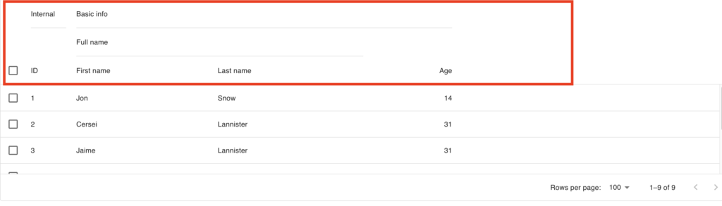
クイックフィルター(Quick filter)
データグリッドの設定のslotProps の中のtoolbar のshowQuickFilter をtrueにすることで簡単なフィルター機能を追加できます。
import * as React from 'react';
import Box from '@mui/material/Box';
import { DataGrid, GridToolbar, GridColDef } from '@mui/x-data-grid';
import { useDemoData } from '@mui/x-data-grid-generator';

const VISIBLE_FIELDS = ['name', 'rating', 'country', 'dateCreated', 'isAdmin'];

export default function DataGridTest() {
  const { data } = useDemoData({
    dataSet: 'Employee',
    visibleFields: VISIBLE_FIELDS,
    rowLength: 100,
  });

  // Otherwise filter will be applied on fields such as the hidden column id
  const columns = React.useMemo<GridColDef[]>(
    () => data.columns.filter((column) => VISIBLE_FIELDS.includes(column.field)) as GridColDef[],
    [data.columns],
  );

  return (
    <Box sx={{ height: 400, width: 1 }}>
      <DataGrid
        {...data}
        initialState={{
          ...data.initialState,
          filter: {
            filterModel: {
              items: [],
              quickFilterValues: ['ab'],
            },
          },
        }}
        disableColumnFilter
        disableColumnSelector
        disableDensitySelector
        columns={columns}
        slots={{ toolbar: GridToolbar }}
        slotProps={{
          toolbar: {
            showQuickFilter: true,
          },
        }}
      />
    </Box>
  );
}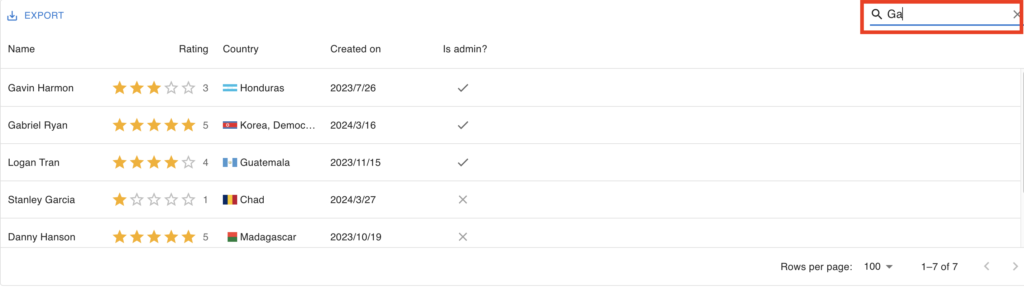
このフィルターは、クライアント側でフィルターする時は、便利ですが、サーバー側でフィルターする場合は、使いにくいので、自前でMUIのTextFieldを使って入力項目を作成し、状態を管理した方がやりやすいです!
ページネーション(Pagination)
データグリッドの設定にpaginationModel を設定することで、ページネーションを実現でき、stateでページやページサイズを管理することができます。
import * as React from 'react';
import { DataGrid, GridColDef } from '@mui/x-data-grid';
import { useDemoData } from '@mui/x-data-grid-generator';

export default function DataGridTest() {
  const { data } = useDemoData({
    dataSet: 'Commodity',
    rowLength: 500,
    maxColumns: 6,
  });
  const [paginationModel, setPaginationModel] = React.useState({
    pageSize: 25,
    page: 0,
  });

  return (
    <div style={{ height: 400, width: '100%' }}>
      <DataGrid
        paginationModel={paginationModel}
        onPaginationModelChange={setPaginationModel}
        {...data}
        columns={data.columns as GridColDef[]}
      />
    </div>
  );
}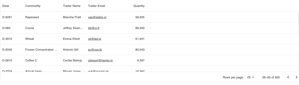
サーバー側でページ分のデータだけを取得して、表示させる場合は、以下のコードを参考にしてください。
import * as React from 'react';
import { DataGrid, GridColDef } from '@mui/x-data-grid';
import { createFakeServer } from '@mui/x-data-grid-generator';

const SERVER_OPTIONS = {
  useCursorPagination: false,
};

const { useQuery, ...data } = createFakeServer({}, SERVER_OPTIONS);

export default function DataGridTest() {
  const [paginationModel, setPaginationModel] = React.useState({
    page: 0,
    pageSize: 5,
  });

  const { isLoading, rows, pageInfo } = useQuery(paginationModel);

  // Some API clients return undefined while loading
  // Following lines are here to prevent `rowCountState` from being undefined during the loading
  const [rowCountState, setRowCountState] = React.useState(
    pageInfo?.totalRowCount || 0,
  );
  React.useEffect(() => {
    setRowCountState((prevRowCountState) =>
      pageInfo?.totalRowCount !== undefined
        ? pageInfo?.totalRowCount
        : prevRowCountState,
    );
  }, [pageInfo?.totalRowCount, setRowCountState]);

  return (
    <div style={{ height: 400, width: '100%' }}>
      <DataGrid
        rows={rows}
        {...data}
        columns={data.columns as GridColDef[]}
        rowCount={rowCountState}
        loading={isLoading}
        pageSizeOptions={[5]}
        paginationModel={paginationModel}
        paginationMode="server"
        onPaginationModelChange={setPaginationModel}
      />
    </div>
  );
}
ソート(Sorting)
MUIのDataGridはデフォルトでソート機能が設定されていますので、特に設定は必要ありません。
不要な場合は、disableColumnSorting を設定すればソートが解除されます。
また、ページネーションと同様にソートして、表示させたい分だけデータ取得する場合は、以下のコードを参考にしてください。
import * as React from 'react';
import { DataGrid, GridColDef, GridSortModel } from '@mui/x-data-grid';
import { UseDemoDataOptions, createFakeServer } from '@mui/x-data-grid-generator';

const VISIBLE_FIELDS = ['name', 'rating', 'country', 'dateCreated', 'isAdmin'];

const DATASET_OPTION: UseDemoDataOptions = {
  dataSet: 'Employee',
  visibleFields: VISIBLE_FIELDS,
  rowLength: 100,
};

const { useQuery, ...data } = createFakeServer(DATASET_OPTION);

export default function DataGridTest() {
  const [queryOptions, setQueryOptions] = React.useState({});

  const handleSortModelChange = React.useCallback((sortModel: GridSortModel) => {
    // Here you save the data you need from the sort model
    setQueryOptions({ sortModel: [...sortModel] });
  }, []);

  const { isLoading, rows } = useQuery(queryOptions);

  return (
    <div style={{ height: 400, width: '100%' }}>
      <DataGrid
        rows={rows}
        {...data}
        columns={data.columns as GridColDef[]}
        sortingMode="server"
        onSortModelChange={handleSortModelChange}
        loading={isLoading}
      />
    </div>
  );
}
まとめ
ReactプロジェクトにMUIのDataGridの始め方と使い方を説明しました。さらに詳細なカスタマイズや機能については、MUIの公式ドキュメントを参照してください。
MUI DataGridを使えば、データの表示と管理をより効果的に行えるようになります。非常におすすめなライブラリなので、是非この記事を参考にMUIを試しに使ってみてください!
